My Process:
I started by creating a Pinterest board and looking into well established makeup brands like Covergirl and Clinique to find inspiration. A lot of makeup brands have minimalistic branding and packaging so I decided to use a condensed serif fonts (Instrument Serif & Cinzel Decorative) and a blue color palette to play off the word rain. Once I settled on a font I found a color palette I thought would fit well and began mocking up ideas for my logo.
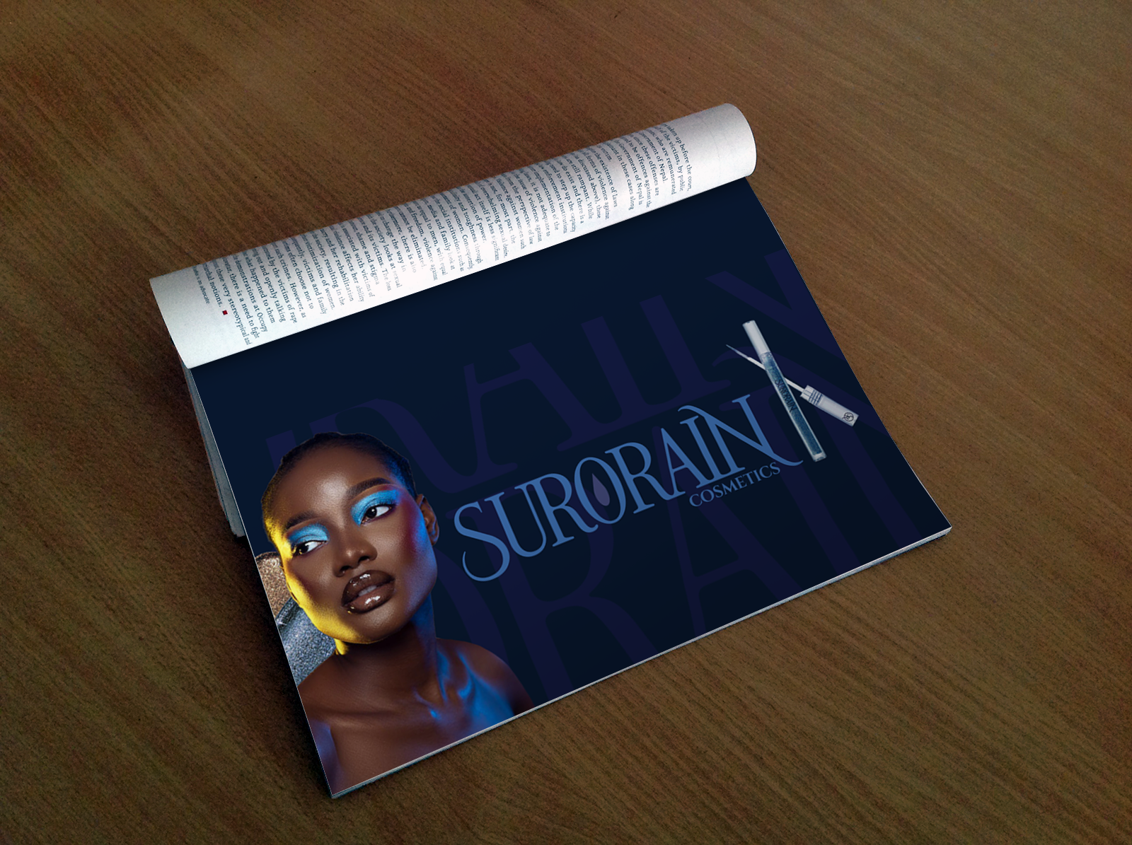
After creating my logotype, colormark and monomark I mocked up an advertisement and collateral. I made the packaging blue to fit with the brand colors and kept the design minimal to keep the brand feeling high end and clean.
One of the main challenges I faced with this project was keeping the branding consistent across a variety of products, I solved this by making several different variations of my logotype but only using blue on products instead of the yellow accent color.